


An icon with a hard-coded fill="#2563eb" ignores your CSS, so it stays the wrong color in dark mode, on hover, and in every theme you ship. Swap that fill (and any stroke) for currentColor and the same SVG inherits its color from CSS — one file, every state, no re-export. This guide covers the currentColor patterns, then how to apply them in Axialis IconVectors with the Fill and Stroke color menus.
Understanding currentColor (What & Why)
currentColor is a special keyword in CSS/SVG. Wherever you use it in an SVG attribute like fill or stroke, it resolves to the element's computed CSS color. This lets you recolor an icon via CSS (e.g., using utility classes or theme variables) without editing the SVG again.
Basic single-color icon — make the path adopt its parent's color:
<!-- HTML -->
<div class="icon text-blue-600">
  <svg viewBox="0 0 24 24" width="24" height="24">
    <path d="…" fill="currentColor"/>
  </svg>
</div>
Stroke-only icon — transparent fill, colored stroke:
<svg viewBox="0 0 24 24" width="24" height="24">
  <path d="…" fill="none" stroke="currentColor" stroke-width="2"/>
</svg>
Mixed icons — parts can stay fixed while others respond to CSS:
<svg viewBox="0 0 24 24">
  <path d="…" fill="#FFB800"/>           <!-- fixed accent -->
  <path d="…" fill="currentColor"/>      <!-- themable layer -->
</svg>
Theme with CSS variables — switch colors per theme without touching the SVG:
:root { --brand: #2563eb; }
[data-theme="dark"] { --brand: #93c5fd; }

.icon { color: var(--brand); }
<div class="icon">
<svg viewBox="0 0 24 24"><path d="…" fill="currentColor"/></svg>
</div>Inline SVG or sprite, not <img> — currentColor works when the SVG is in the DOM (inline or via <use>). An <img src="icon.svg"> won't inherit CSS color into the file.
<!-- Sprite pattern -->
<svg style="display:none">
  <symbol id="icon-check" viewBox="0 0 24 24">…</symbol>
</svg>

<!-- Instance adopts parent color -->
<svg width="24" height="24" class="text-emerald-600">
  <use href="#icon-check" fill="currentColor"/>
</svg>Tip: if strokes look too thin when scaling up, add vector-effect="non-scaling-stroke":
<path d="…" stroke="currentColor" stroke-width="2" vector-effect="non-scaling-stroke"/>Doing it in IconVectors
The code viewer you open with F3 (View → Source Code) is read-only. Use the color menus to write currentColor into the SVG for you.
- Open your icon in IconVectors.
- Select the shapes you want to be themeable (on the canvas or in the Element list).
- Set Fill to
currentColor:- Open the Fill color menu.
- Choose the special item
currentColor(marked with a "C" icon in the menu):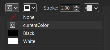
- This writes
fill="currentColor"in the SVG.
- For stroke-based icons, open the Stroke color menu and choose
currentColorthere as well (this writesstroke="currentColor"). - Transparent parts: if a region must stay empty, set Fill to
None(so only the stroke or underlying shapes show). - Verify with
F3(read-only viewer). In the SVG tab you should now seefill="currentColor"orstroke="currentColor"on the selected elements. Use this panel to check theviewBoxis present too (e.g.,viewBox="0 0 24 24"). - Export your icon:
- Use your usual export (or Minified export) to ship a compact file.
Quick examples from IconVectors — after choosing currentColor in the menus, your code will look like:
<!-- Fill-based -->
<path d="…" fill="currentColor"/>

<!-- Stroke-based -->
<path d="…" fill="none" stroke="currentColor" stroke-width="2"/>
Use the result in your app
Plain HTML/CSS — change color with CSS:
<style>
  .btn-icon { color: #2563eb; }        /* any CSS color or variable */
</style>

<button class="btn-icon">
  <svg viewBox="0 0 24 24" width="20" height="20">
    <path d="…" fill="currentColor"/>
  </svg>
  Save
</button>
React — pass color via style or class:
import Check from "./check.svg";

export default function Example() {
  return (
    <div style={{ color: "#16a34a" }}>
      <Check width={20} height={20} />
    </div>
  );
}
Vue — bind color through style or a class on the wrapper:
<template>
  <span :style="{ color: active ? '#16a34a' : '#64748b' }">
    <svg viewBox="0 0 24 24" width="20" height="20">
      <path d="…" fill="currentColor"/>
    </svg>
  </span>
</template>
Sprite — multiple instances, one definition:
<svg style="display:none">
  <symbol id="icon-star" viewBox="0 0 24 24">…</symbol>
</svg>

<svg class="text-amber-500" width="20" height="20"><use href="#icon-star" fill="currentColor"/></svg>
<svg class="text-slate-500" width="20" height="20"><use href="#icon-star" fill="currentColor"/></svg>
Troubleshooting
- Color doesn't change — at least one shape still has a hard-coded
fill="#…"orstroke="#…". Reselect that shape in IconVectors and set Fill/Stroke tocurrentColor. Then verify in the read-only code view (F3). - Inline works, <img> doesn't — expected. Use inline SVG or a sprite (
<use>). An<img>can't inherit CSScolorinto the SVG file. - Only some parts recolor — that's normal if only those paths use
currentColor. If you want the whole icon to change, setcurrentColorfor all relevant fills/strokes. - Scaling issues with strokes — use
vector-effect="non-scaling-stroke"for uniform stroke width across sizes.
Related guides
- Accessible SVG Icons (ARIA roles & labels)
- How to Use SVG Icons in Web Applications
- Pixel-Perfect SVG Icons
Start Making SVG Icons Today with IconVectors
Download the fully-functional 30‑Day Free Trial and unlock your icon design workflow.
Version 1.70 for Windows and macOS